Custom Template Capabilities
Wastebits allows custom waste profile templates, with a variety of field types already supported within the application. This article outlines the existing capabilities for customization that are available.
Written by Ryan Battles
Updated on Jul 26, 2022
Included Fields
No matter the custom fields your waste stream template includes, there are a few that are included by default.
- Waste Stream Name*
- Facility Site*
- Generator Site*
- Billing Site
- Material Origin
* required
The above fields would constitute a bare-minimum waste stream. The types of fields that follow are able to be customized and added to this waste stream template to make it more complete.
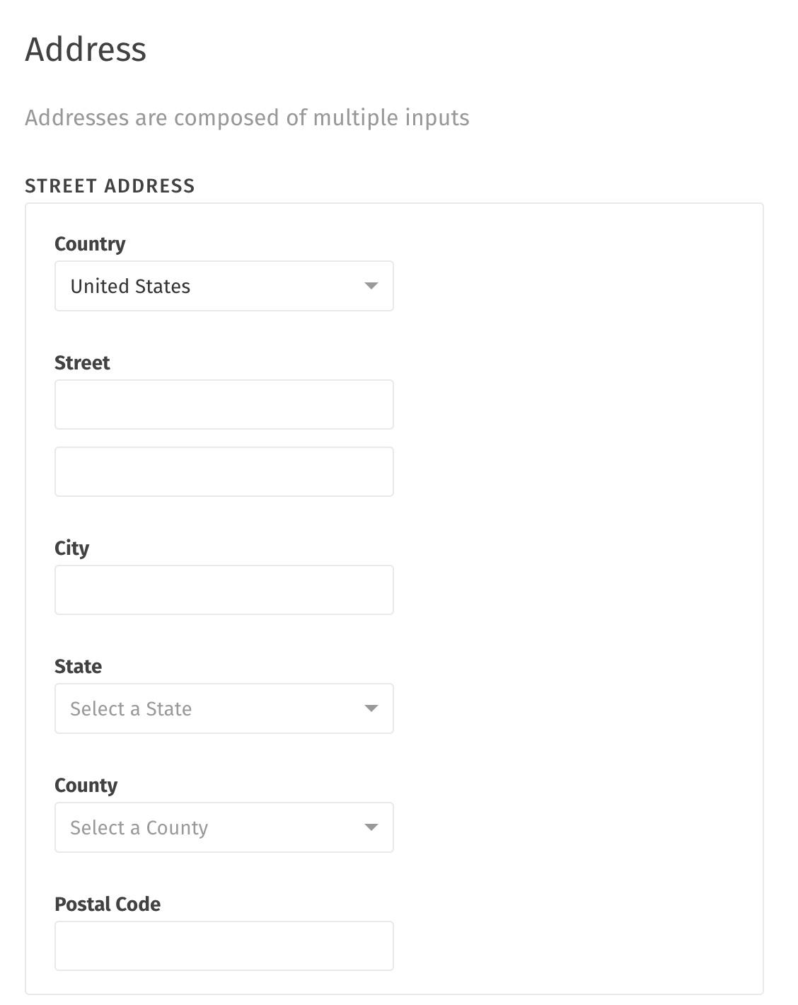
Address
An address field will consist of a standard group of fields that constitute a United States, Canadian, or Mexican address.
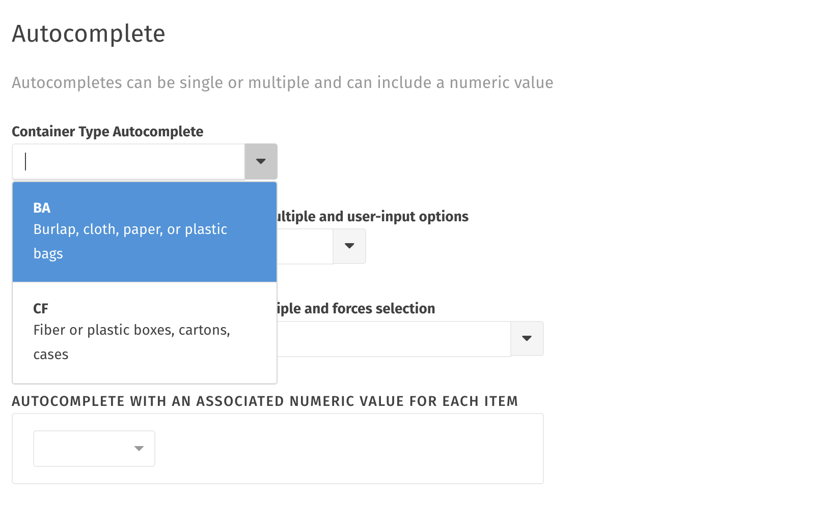
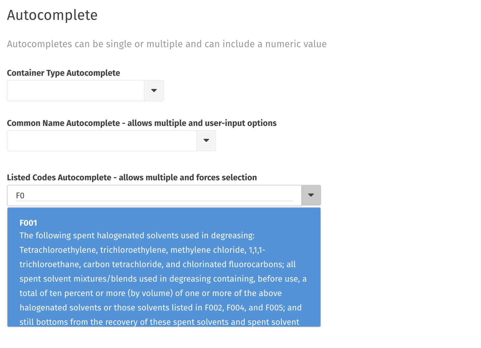
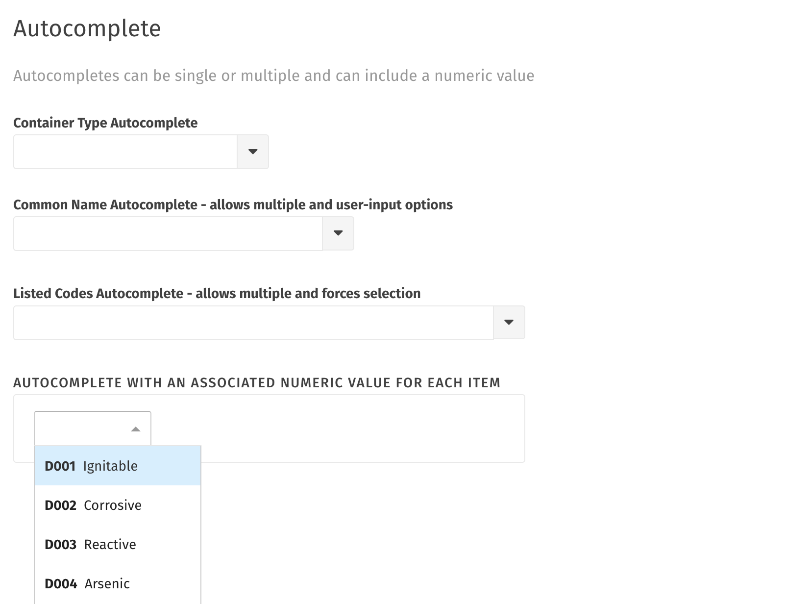
Autocomplete
There are several types of autocompletes available within Wastebits:
Container Type Autocomplete
Common Name Autocomplete (allows multiple and user-input options)
Listed Codes Autocomplete (allows multiple and forces a selection)
Industry Codes Autocomplete
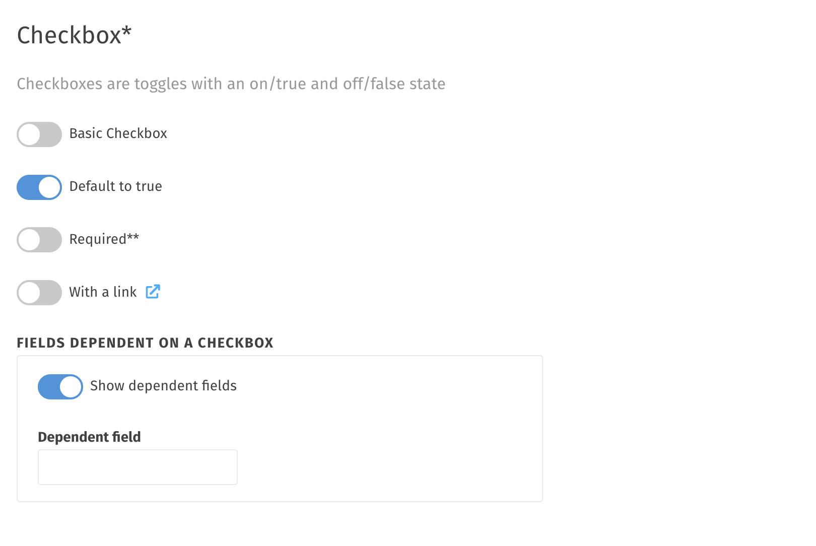
Checkbox
In Wastebits, checkboxes appear as toggles/switches to clearly show an on/off status. Several types of checkbox can be created within a waste stream template:
- Basic checkbox (defaults to false)
- A checkbox that defaults to true
- A checkbox that is required to be toggled before progressing
- A checkbox that includes an external link for more information
- A checkbox that reveals dependent fields below it (they are hidden until the toggle is checked).
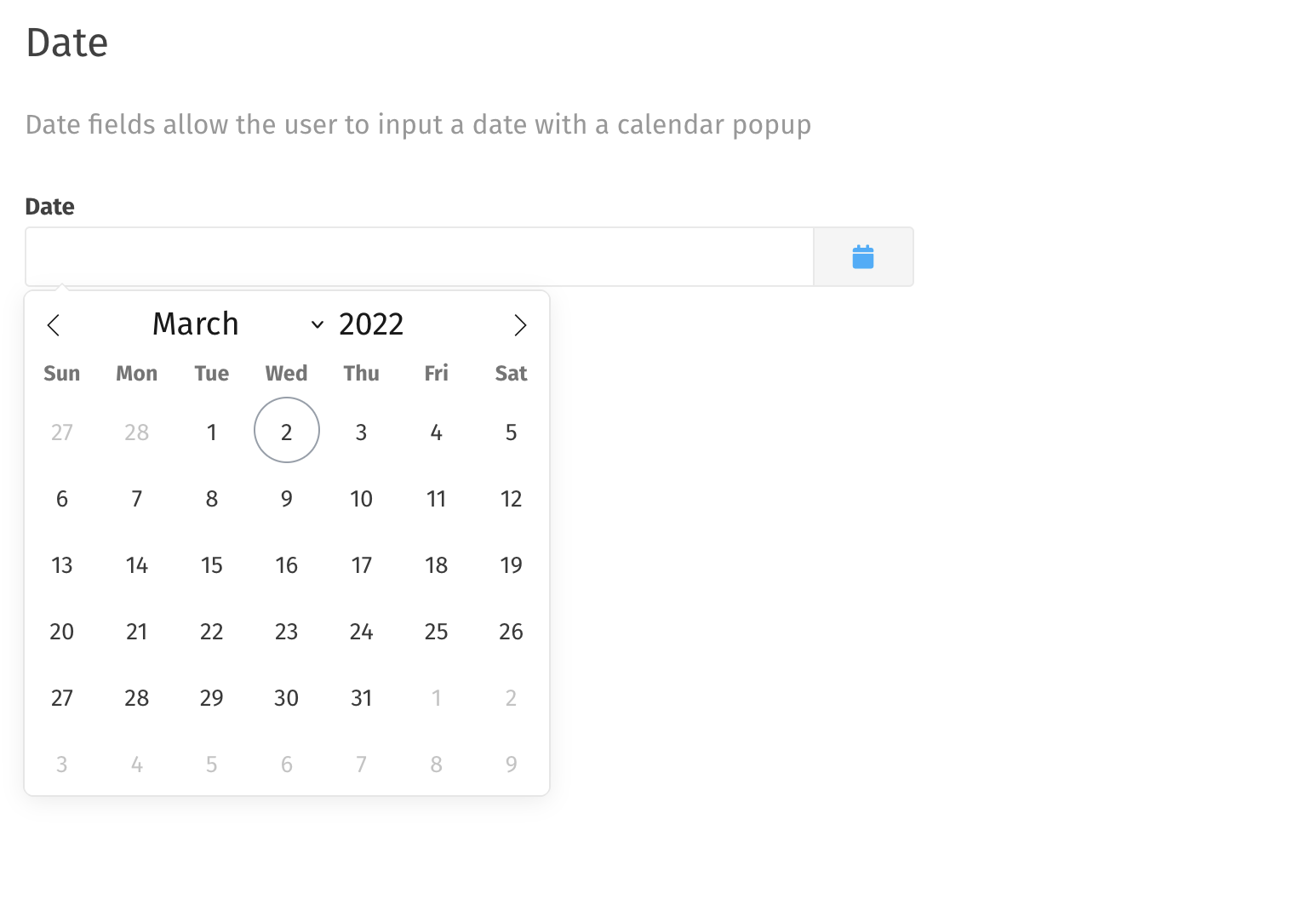
Date
A date field shows a popup calendar and ensures valid formatting for a date entry.
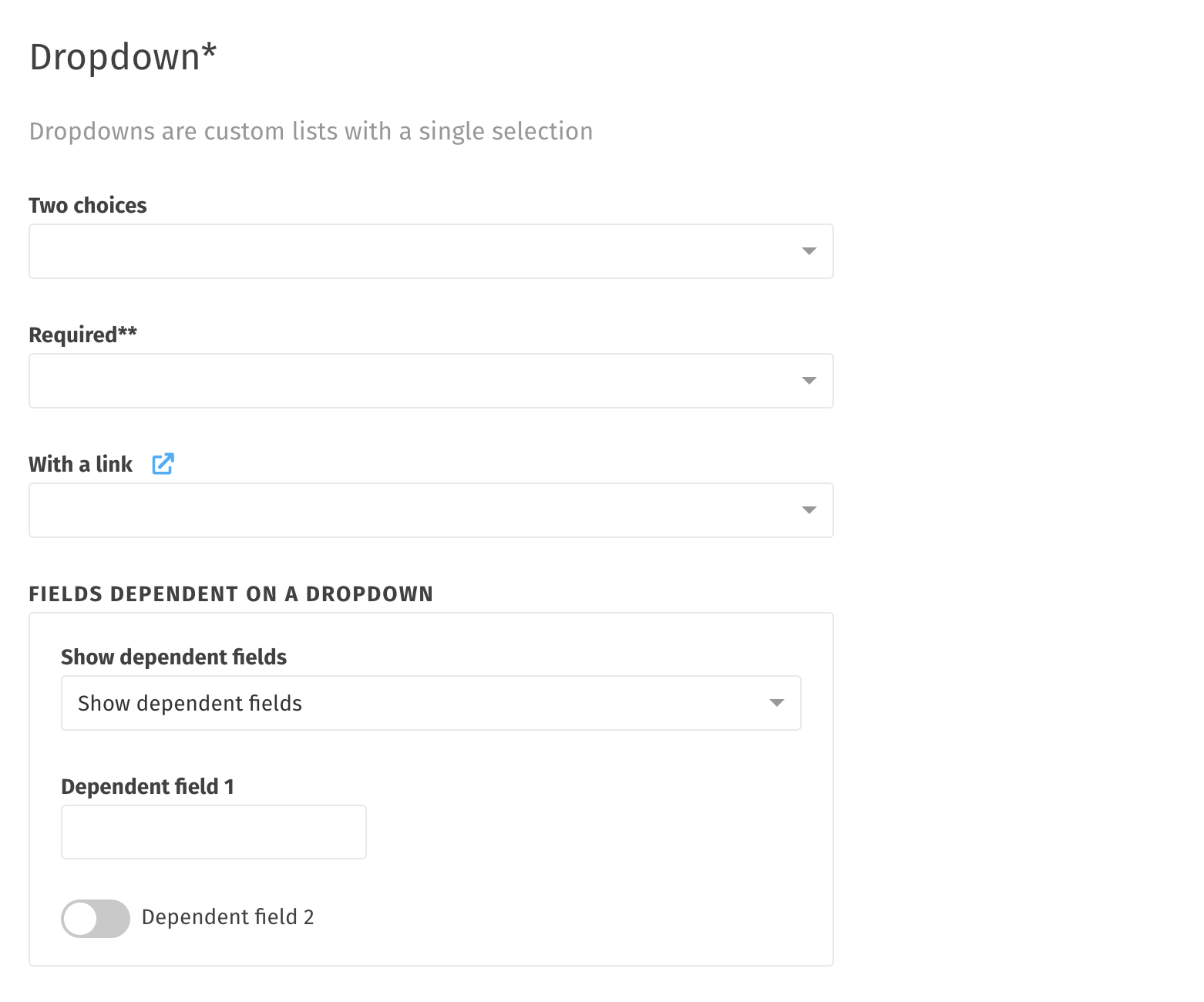
Dropdown
Like checkboxes, there are several options available for dropdown menus:
- Two choices (such as "yes" and "no")
- A required dropdown that forces a selection before being allowed to progress
- A dropdown with an external link for more information
- A dropdown that shows dependent fields (or no further fields) based on what was selected.
Note: while traditional dropdowns allow a single selection, it IS possible to create one that allows multiple selections.
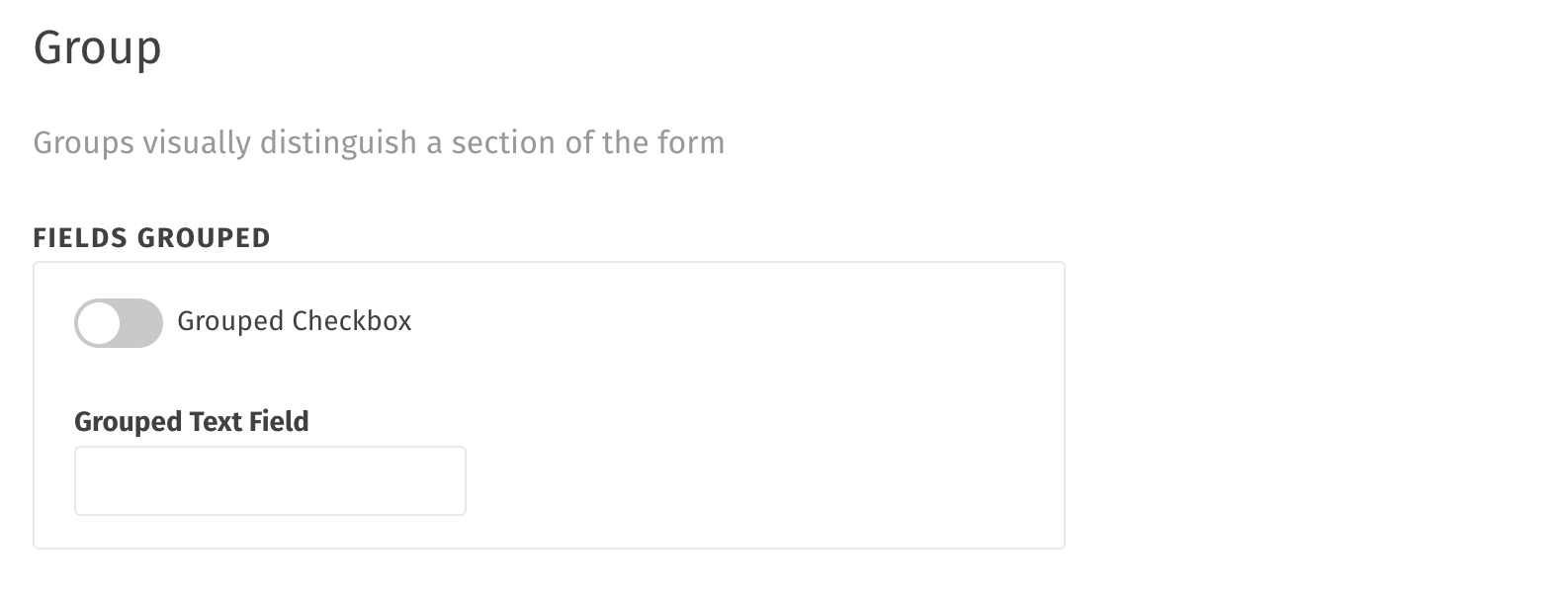
Group
Fields can be grouped together under a heading to visually distinguish a section on a form.
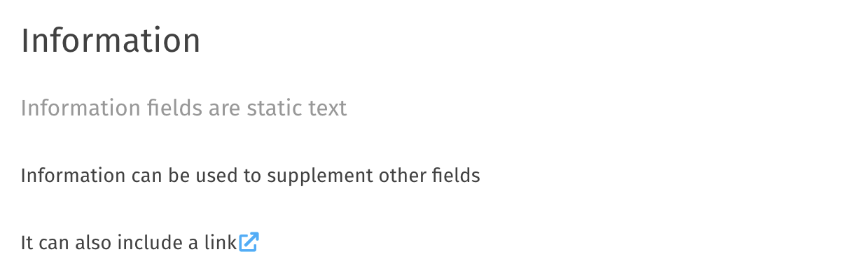
Information
An information field is simply text added to a form in order to provide additional information. These can also include a link to external information if needed.
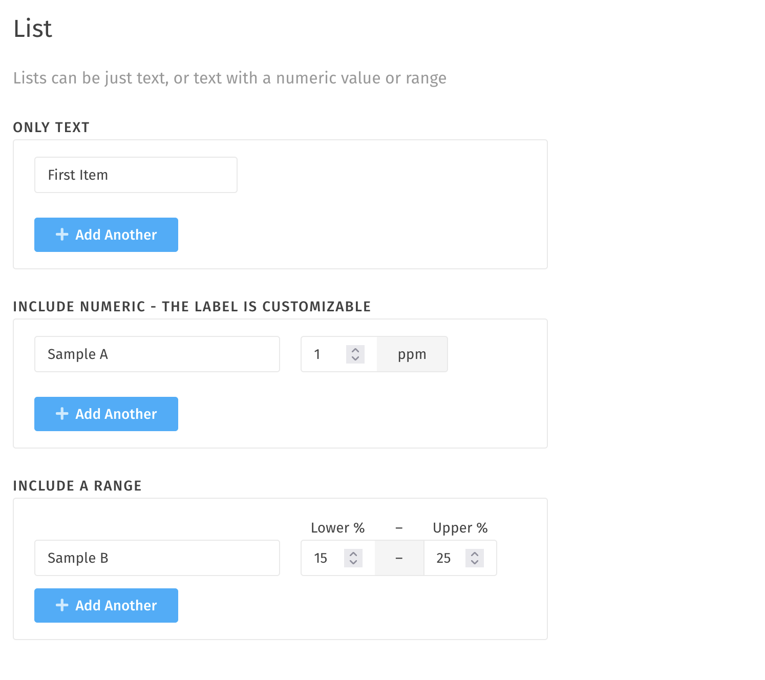
List
A list field can handle one or more items added to it (i.e. a constituents field). Here are the options for a list field:
- Text Only
- Text with a numeric value
- Text with a numeric range
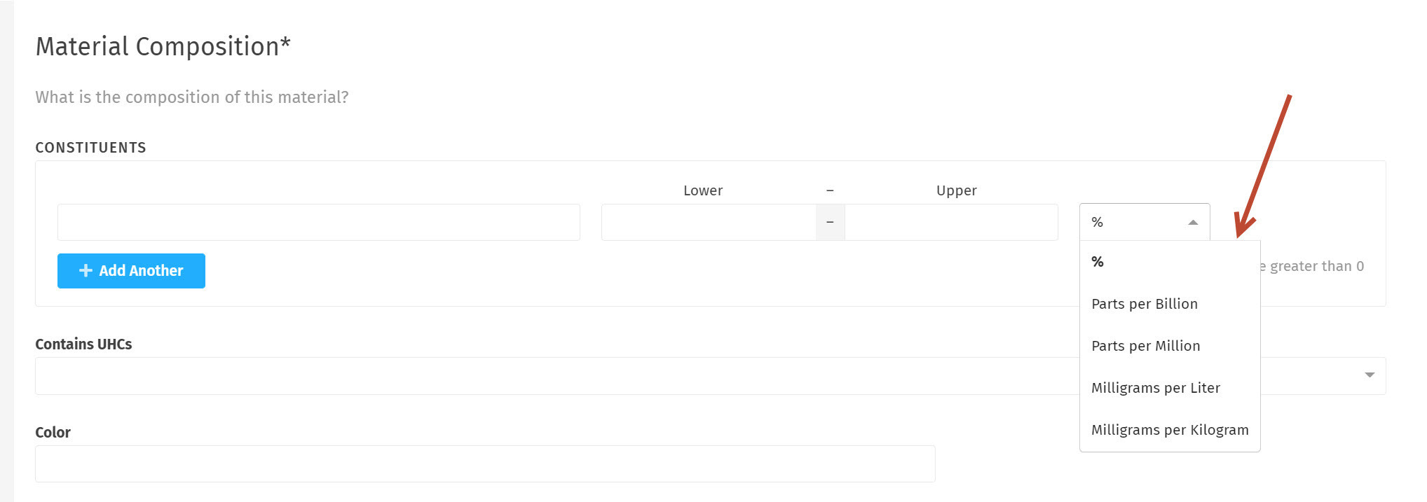
Constituents
Customize your constituent measurement values. Shown here are a few examples of currently available options. If there are any additional options you would like to have but don't see here, we can get them added for you.
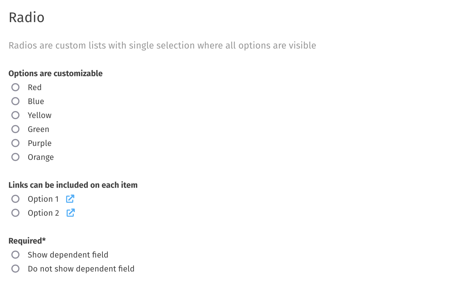
Radio
Radios are similar to select fields except they are all visible to the user and only one may be selected. As with some other fields, these can include a link and/or be required to progress.
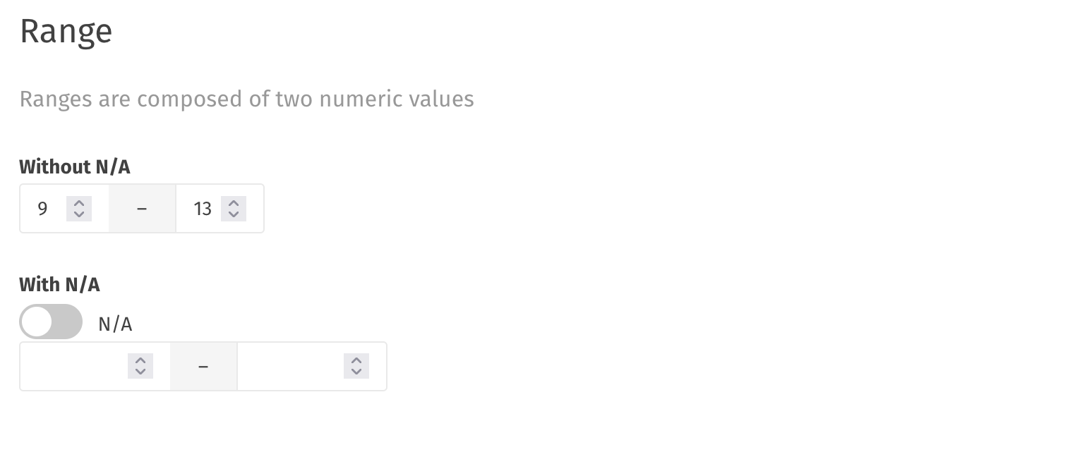
Range
A range is a couple of numeric values that show an upper and lower end. There is also the option to include an "N/A" toggle that will remove the range from the form if it is not applicable.
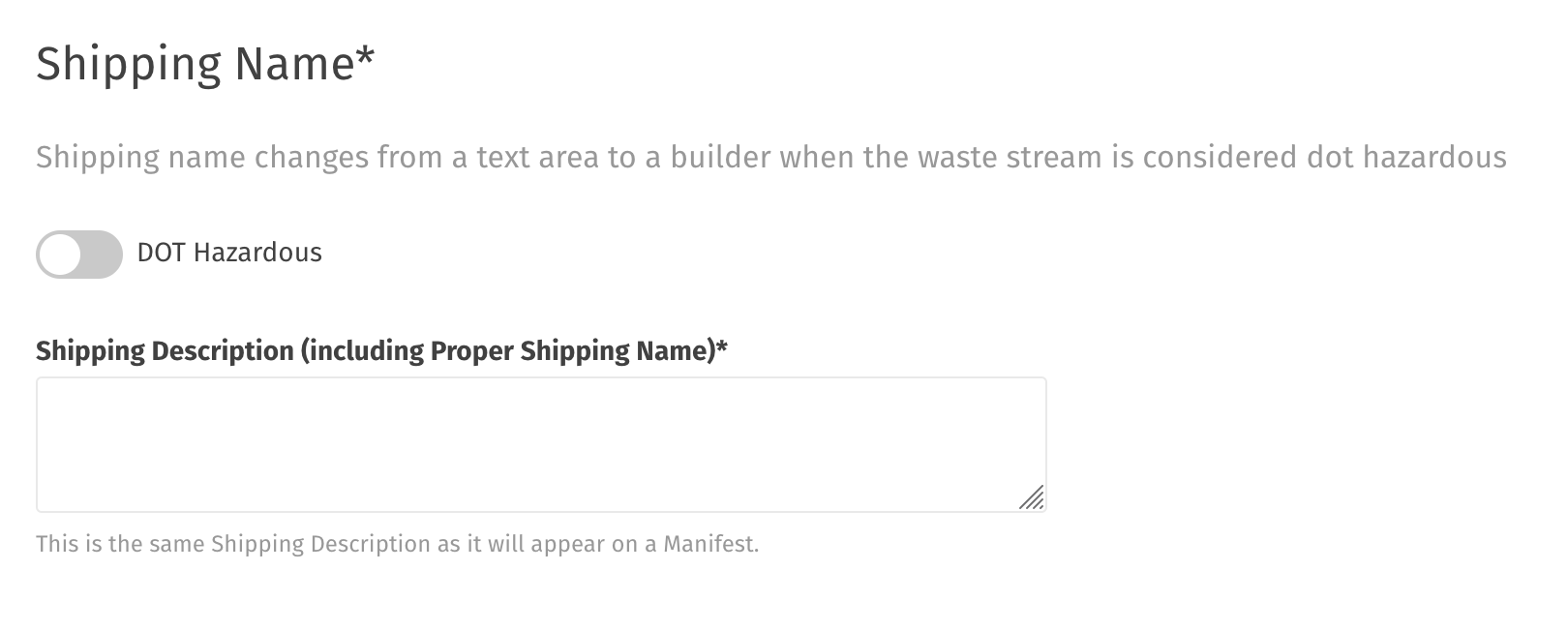
Shipping Name
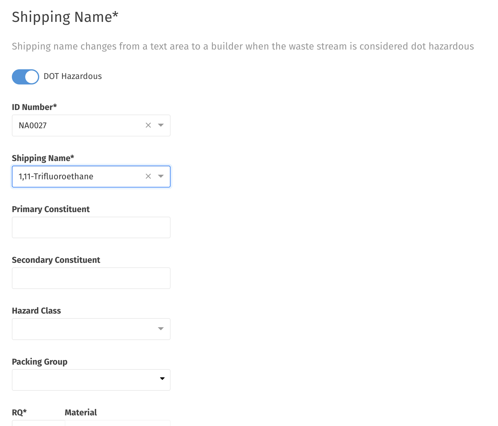
A shipping name changes from a text area to a builder (progressive fields appear as it is filled out) when the waste stream is considered DOT Hazardous (see two screenshots below as the option is toggled).
...and after toggling DOT Hazardous and selecting a couple items:
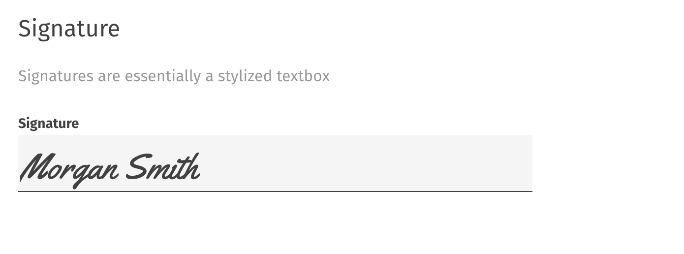
Signature
A signature field will stylize the text as it is typed in.
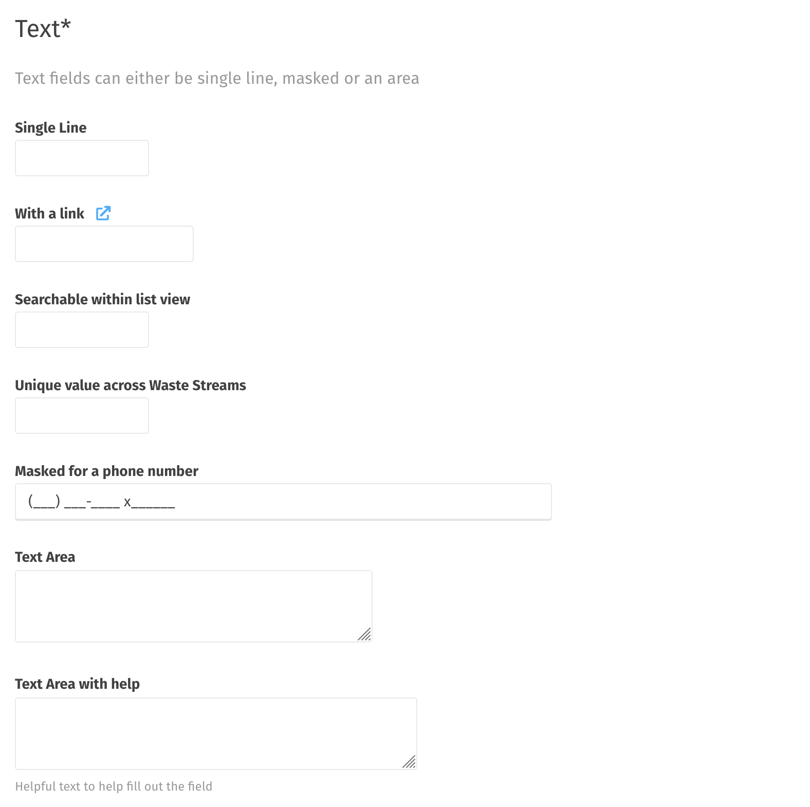
Text
A text input is the most basic type of entry, and can either be single line or multi-line (a text area). Here are some options:
- Basic single line
- Single line with a link
- A single line that is searchable within a list view of waste streams
- A single line that is unique across waste streams (duplication will cause an error)
- A single line that is masked (forces a format as they type, like a phone number)
- Text area
- Text area with help text
- Any text field can be made required
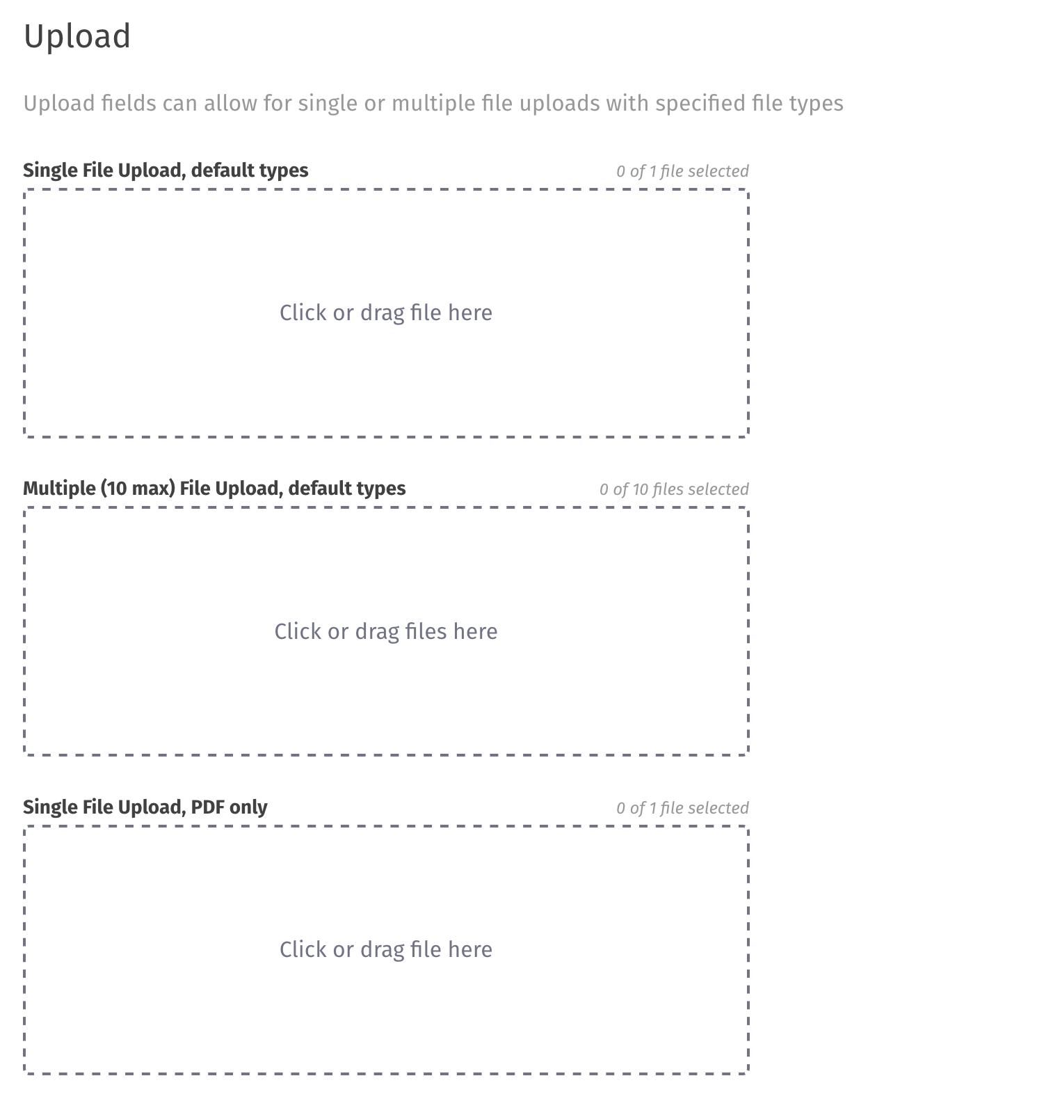
Upload
Upload fields can be for single files or multiple files, and can be restricted by file type or file size.
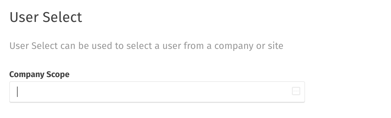
User Select
A user select is a text field that autocompletes with the name of a user that is part of the company or site (you can choose which scope to include in the search).
Help Text
Besides the information field type described above (which allows for plain text to be entered into the template) there are a couple more options for help text:
- Help text that appears below the field (example is in the text fields above)
- Tooltip popover text that appears when the mouse hovers over an icon.
Limitations
The waste stream template and the certification are created from templates, and are therefore customizable. Outside of those there are no customization available without requiring custom development.
The print view will include all custom fields and allowed customizations to the template, but the general look/feel of the print template is not configurable. It is, however, possible to hide a certain field or fields from the print view if desired.
Next Steps
If you are interested in implementing custom templates for your waste streams, please contact us to discuss options and steps forward.